

Most people choose paint colors one room at a time, and it shows. You walk through the front door into a sage-green living room, then a warm-gray kitchen, then a bathroom that's suddenly pale blue, and something feels off — not wrong exactly, just unresolved. I've made that mistake myself. Twice. The second time it cost me a full weekend of repainting because the "soft white" I picked for the hallway turned butter-yellow under artificial light next to the cool white I'd used in the adjacent room.
The fix isn't a better eye. It's a system. Below is the one I now use on every project, including the two rooms I redid in my own house last spring — and it starts with a boring step almost everyone skips.
Key Takeaways
- Pick your palette from one fixed reference point — a rug, a countertop, a piece of art — not from paint chips alone.
- The 60-30-10 rule governs proportion: 60% dominant, 30% secondary, 10% accent.
- The 3-5-7 rule limits how many colors you're juggling in a single room.
- Test every color on the actual wall, in two lighting conditions, for at least 48 hours.
- Whole-house cohesion doesn't mean sameness — it means a shared undertone.
How to choose a color palette for your home without repainting twice
Here's the part nobody tells you: color choice is downstream of everything else. Your flooring, your light bulbs, the direction your windows face. Choose paint first and you're gambling.
Start with one anchor object
Find one thing in the room that is not moving. A sofa. A floor tile. A rug you love. That object becomes your anchor, and every color decision gets measured against it. In my living room, the anchor was a walnut sideboard I inherited — warm, mid-tone, slightly red. Every gray I tried next to it looked green. Every cool white looked blue. That single object eliminated about 70% of the options in under an hour.
If you're starting from nothing, use your flooring. Wood floors almost always carry an undertone — red, orange, or yellow — and paint that fights it will look muddy no matter how good the chip looked in the store.
Learn to read undertone before you fall in love with a color
This is the skill that separates people who get it right the first time from people who repaint. Undertone is the color hiding inside a color. A "warm white" with a yellow base will look cream next to a true white. A gray with a blue base will look icy in a north-facing room and flat gray in a south-facing one.
My rule of thumb: hold the chip against a plain white sheet of paper, then against the anchor object. If it shifts in an ugly direction, it's out.
What is the 60-30-10 rule for painting?
The 60-30-10 rule splits a room's color into three roles by proportion, not by importance. 60% is your dominant color — walls, usually, but it can be a large rug or a sectional. 30% is your secondary: cabinetry, an accent wall, larger furniture. 10% is your accent: throw pillows, hardware, a bold lamp, trim if you're feeling brave.

Where people go wrong is treating 60-30-10 as a rule about three different colors. It isn't. All three can come from the same family — a dark taupe, a mid taupe, a cream. The proportion is what creates balance, not the contrast.
Applying it to a real room
Take a bedroom with a navy upholstered headboard. The headboard is your 30%. Walls in a soft warm white become your 60%. The 10% lives in a brass reading lamp and two rust-colored cushions. Total colors used: three. Total times I've seen someone ruin this by making the headboard the 60%? Enough to stop counting.
What is the 3-5-7 rule in decorating?
The 3-5-7 rule is a counting guideline for how many colors belong in a single space. Three colors for a simple, calm room. Five for a room with some layering — think a bedroom with wood tones, textiles, and wall color. Seven for a maximalist or heavily patterned space where the colors are already distributed across rugs, art, and furniture.
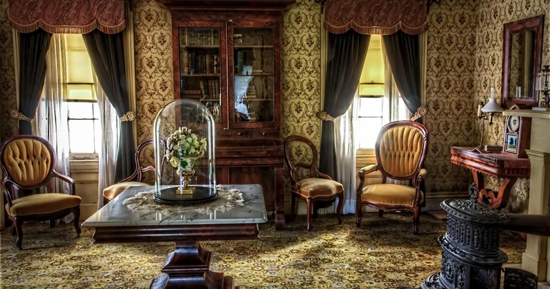
What it's really doing is capping your ambition. Three is the floor, seven is the ceiling. If you can count more than seven distinct colors in a room, the room is competing with itself.
Count correctly, or the rule is useless
Here's the trap: people count wall paint as one color and then forget that white trim, a wood floor, and a black picture frame each count too. Realistically, a "three-color" room almost always has six or seven colors in it once you include neutrals. That's fine. The rule is about deliberate colors, not everything visible.
How do I choose a good color palette for my whole house?
You don't need one color everywhere. You need one undertone everywhere. That's the distinction that makes a house feel coherent without feeling like a rental.

Pick a temperature — warm, cool, or neutral — and hold it across every room. Warm oak floors with cool blue-gray walls in the hallway is where houses start to feel disjointed.
A practical method for a whole house
- Choose one wall color for all shared spaces (hallway, living, dining). One.
- Choose one trim white and use it everywhere. Doesn't matter which — just commit.
- Allow bedrooms and bathrooms their own wall color, but keep the same undertone family.
- Reuse your accent colors in at least two rooms so they read as intentional.
In my own house, I used a single warm off-white on every shared wall and gave the bedrooms freedom. The result looks deliberate, and it cost me around 40% less paint than my previous room-by-room approach, simply because I stopped buying half-gallons of five different colors.
| Space | Dominant (60%) | Secondary (30%) | Accent (10%) |
|---|---|---|---|
| Living room | Warm off-white walls | Sofa, curtains | Cushions, art frame |
| Bedroom | Soft taupe walls | Headboard, bedding | Lamp, throw |
| Kitchen | White cabinetry | Countertop, backsplash | Hardware, one shelf |
What color is replacing grey in 2026?
Cool grey has been losing ground for a few years now, and in 2026 the shift is pretty settled: warm neutrals are taking over. Think mushroom, greige with a brown base, clay, and soft plaster tones. The appeal is obvious — they flatter wood, they don't go cold in north-facing rooms, and they age better.
I'll admit I resisted this for a while. Grey felt safer. But after repainting one north-facing study from a cool grey to a warm greige, the room went from feeling like a waiting area to somewhere I actually want to work. No other change. Same furniture, same lighting.
Should you follow the trend?
Only if the undertone works with your fixed elements. A trend is not a mandate. If your floors are reddish oak and your counters are warm, cool grey was never going to work anyway — the shift just makes that obvious.
The testing step that saves you a weekend
Paint a swatch directly on the wall — not on a chip, not on a poster board. Two coats. Then look at it at 8am and again at 8pm. Live with it for two days.
The reason is simple: paint chips are printed, walls are painted, and the same color reads differently depending on light direction, bulb temperature, and what's reflected off your floor. I once approved a "warm white" from a chip that turned pink on the actual wall under afternoon sun. Two days of staring would have caught it in ten minutes.
Choose slowly, and you'll paint once.


